THORNBAUM
Logo and Visual Identity Design
Bonn, Germany 2023
Thornbaum is a German architectural studio based in Bonn, Germany, focusing on a wide range of projects, from commercial buildings and residential projects to urban planning concepts and ephemeral spacial installations. The one thing to link all these ventures is their love for brutalist architecture, an aesthetic the studio has based their design on since their start in 2012.
We were tasked with reinventing Thornbaum and help them create a homogenous brand that is in line with their philosophies and aspirations found in their architectural work.
Studio Maller © 2023
Concept Breakdown
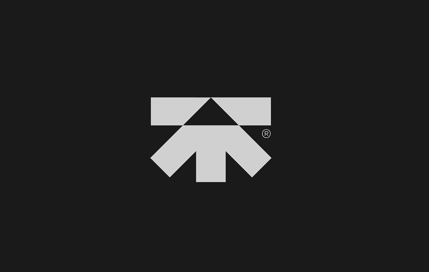
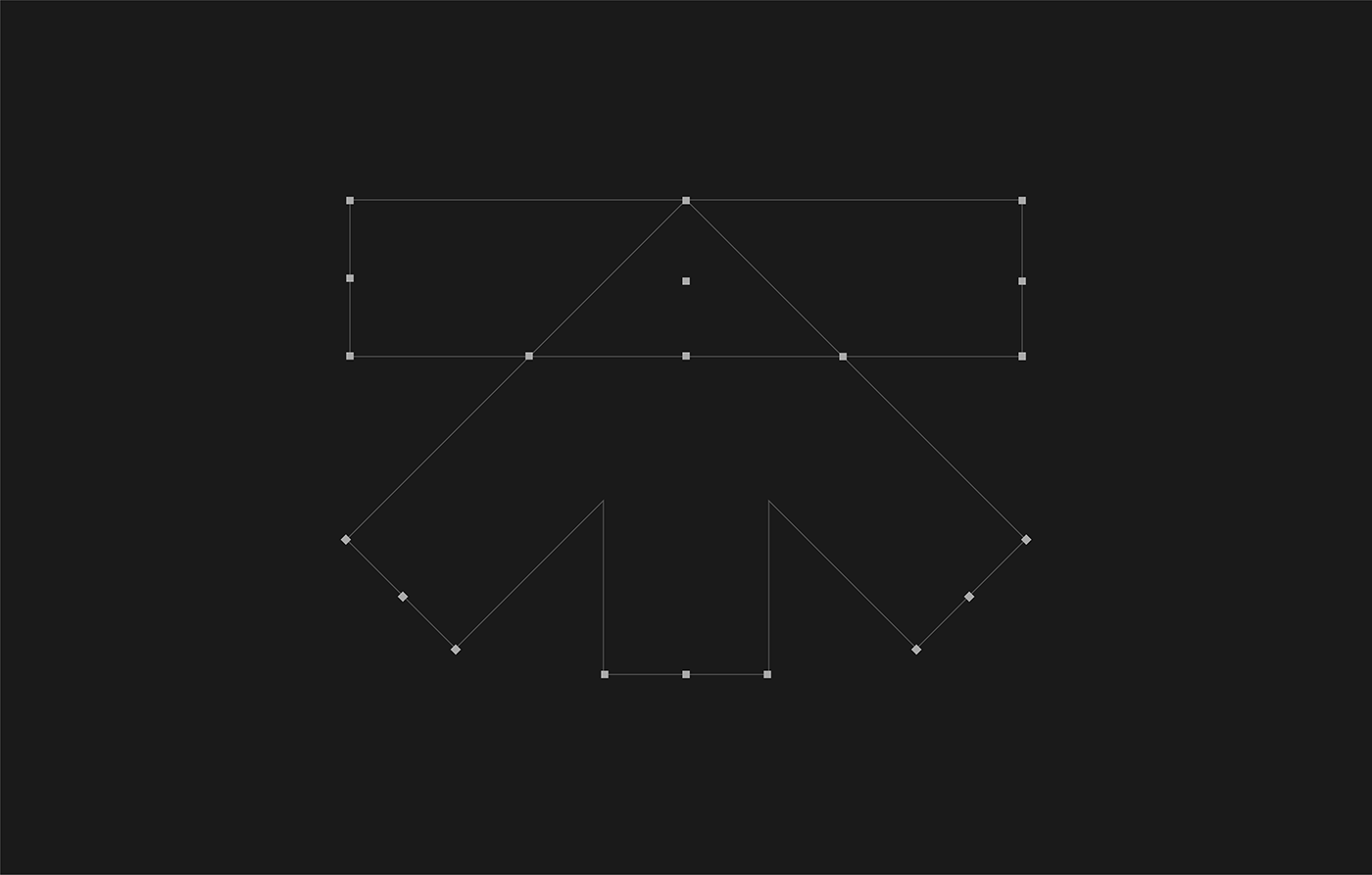
Logo Architecture & Design Language
The name Thornbaum is a combination of the owners names, Thorley Seedorf, a well known architect who has worked in Berlin most of his career and was one of the founders of HUMM. A few years after HUMM's start, Sebastian Baumgartl joined the team first as an apprentice under the tutoring of Thorley. In 2012 they started Thornbaum together, and have since challenge the traditional norms of contemporary european architecture and redefined brutalism in Germany.

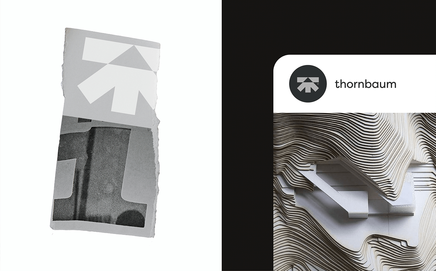

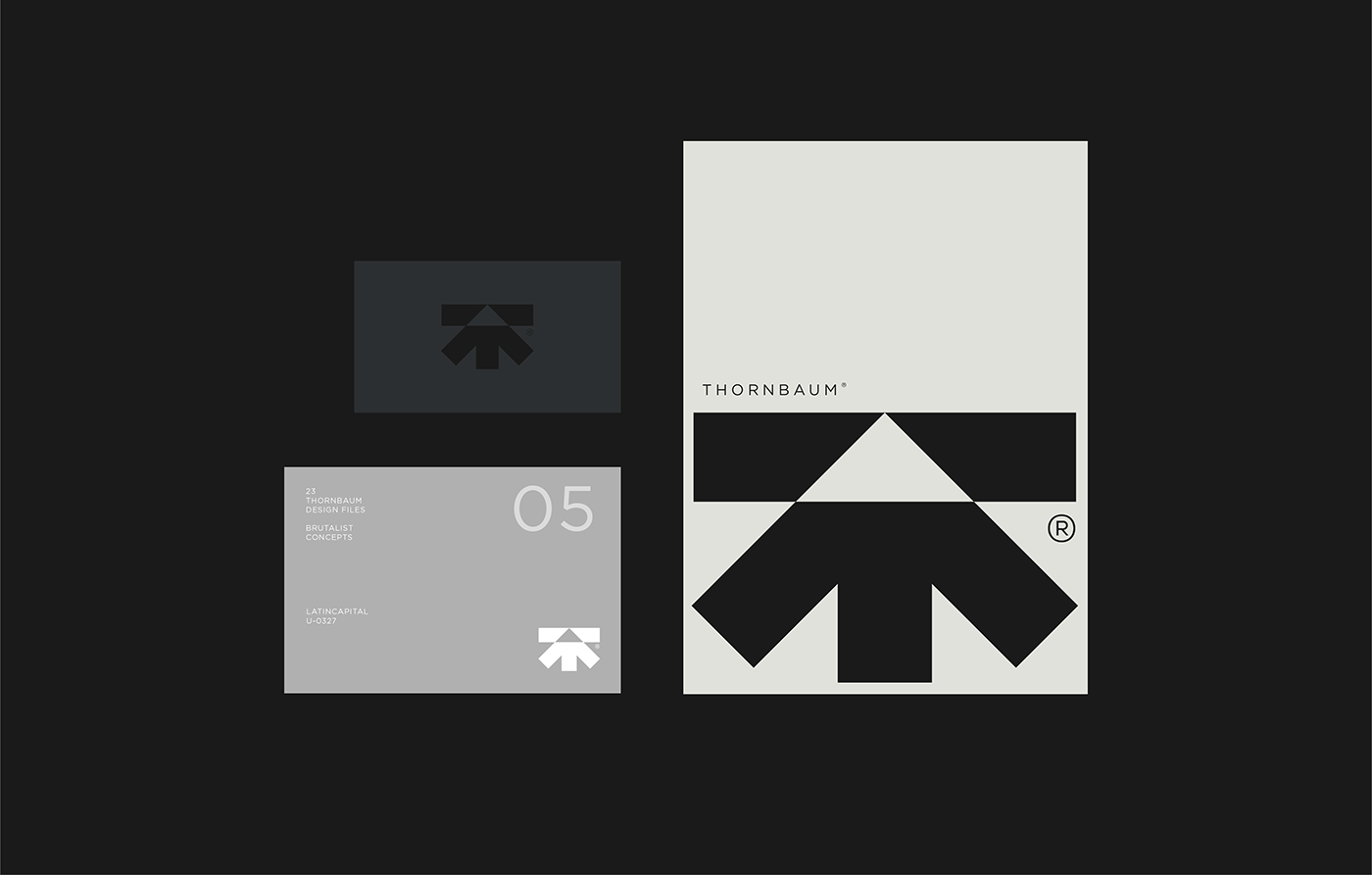
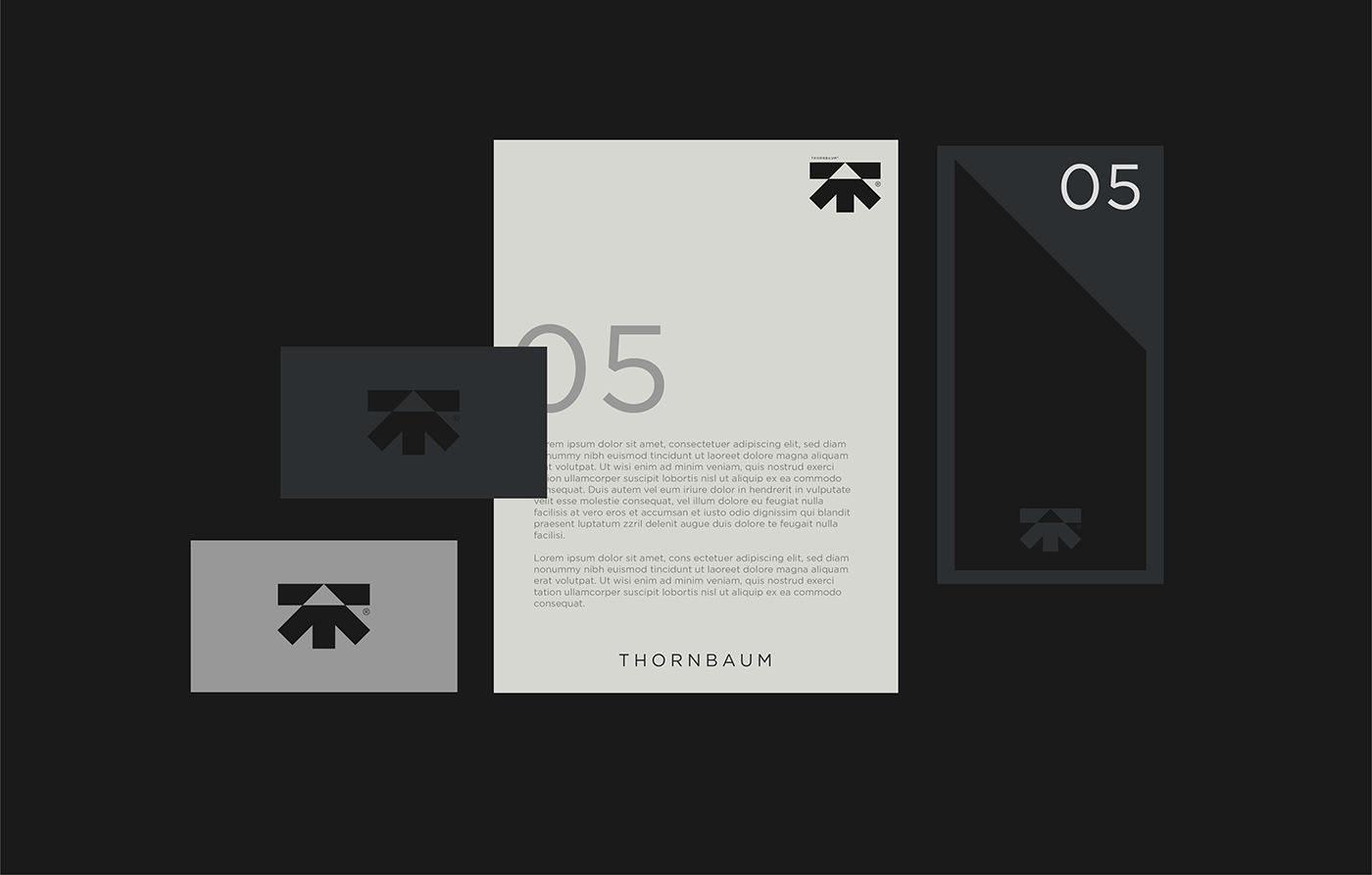
Brand Elements
Print Design & Visual Identity
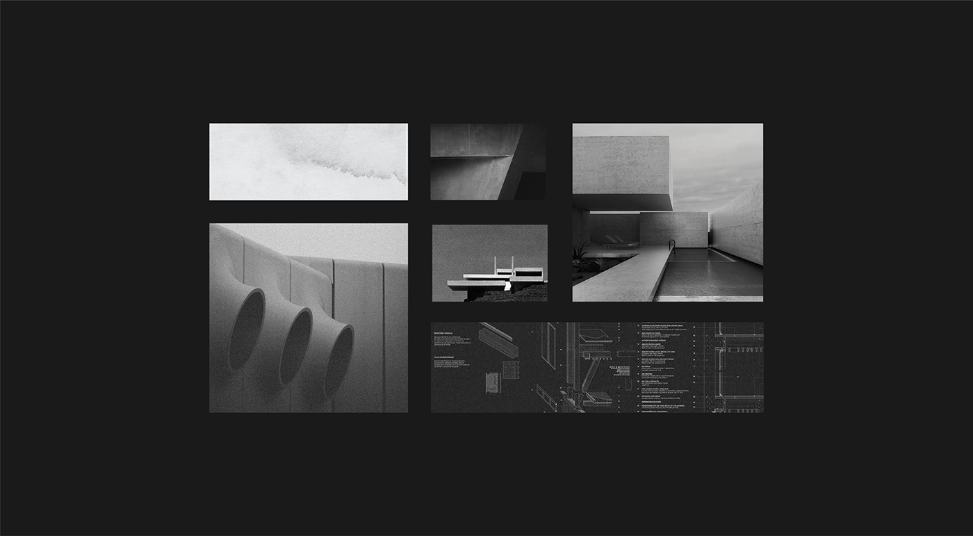
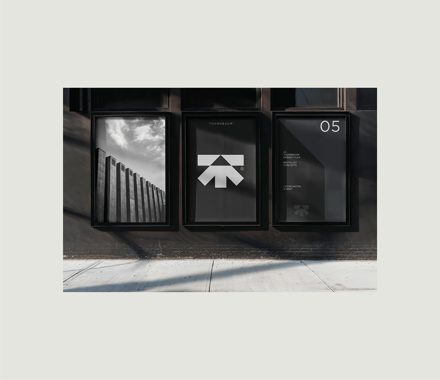
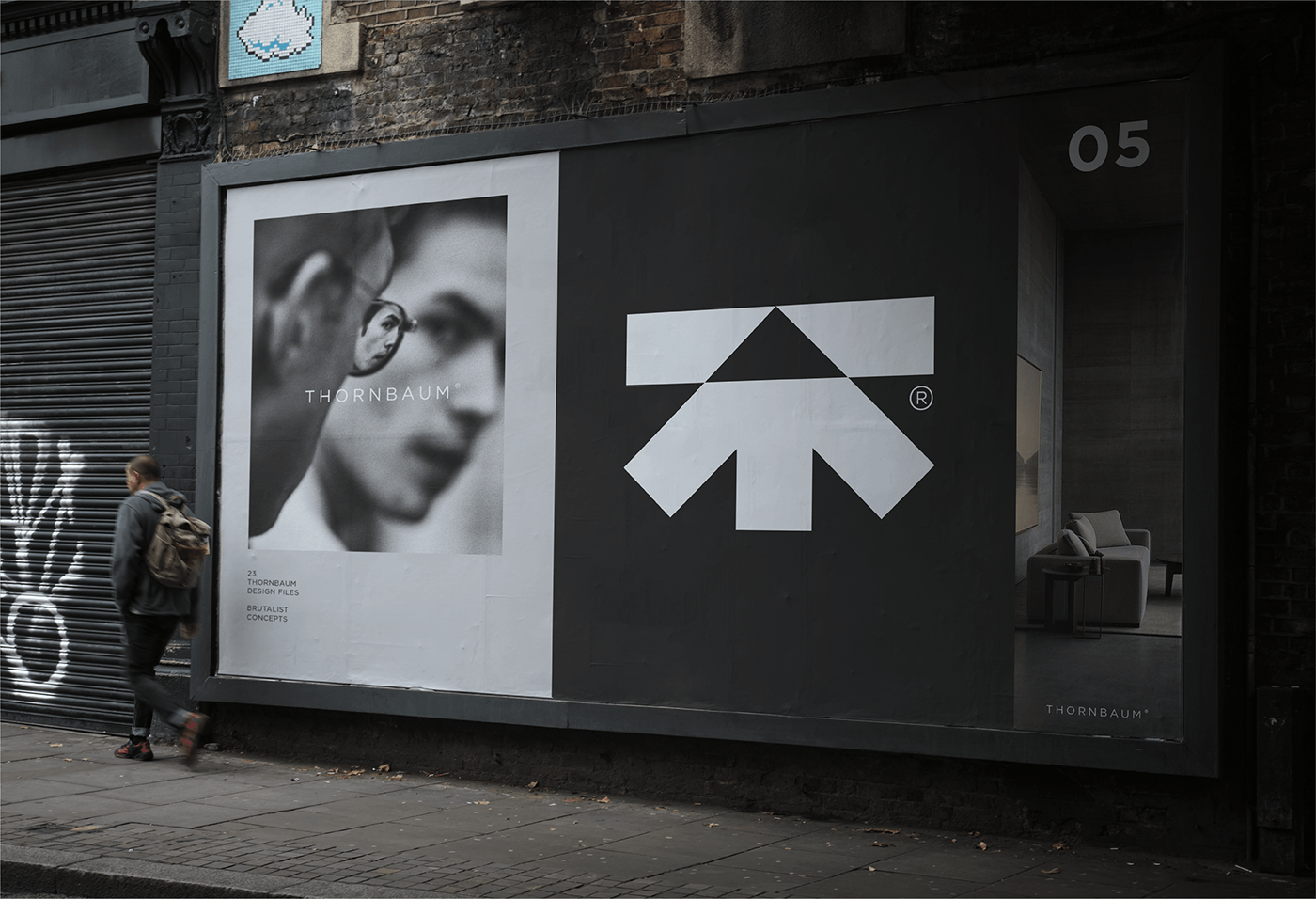
Continuing our exploration into minimal symbols, the visual language for Thornbaum is a strong reference and tribute to brutalism and minimalism, which laid the foundations for contemporary architecture. Brutalism emerged after the Second World War but was rooted in the ideas of functionalism and monumental simplicity that had defined earlier architectural modernism. As seen in other works of ours, we do prefer a minimalist approach to branding and visual expression, so Thornbaum was the perfect platform to go as minimal as we could, both with the logo as well as with color, typography and form.
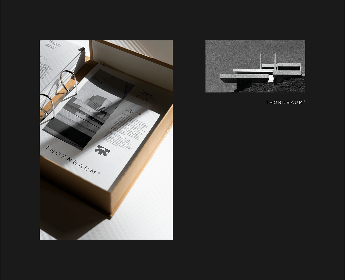
A key part of the project was the design and execution of the studios 5th architectural guide, which including their previous work as well as more recent design projects that inspired the two founders.

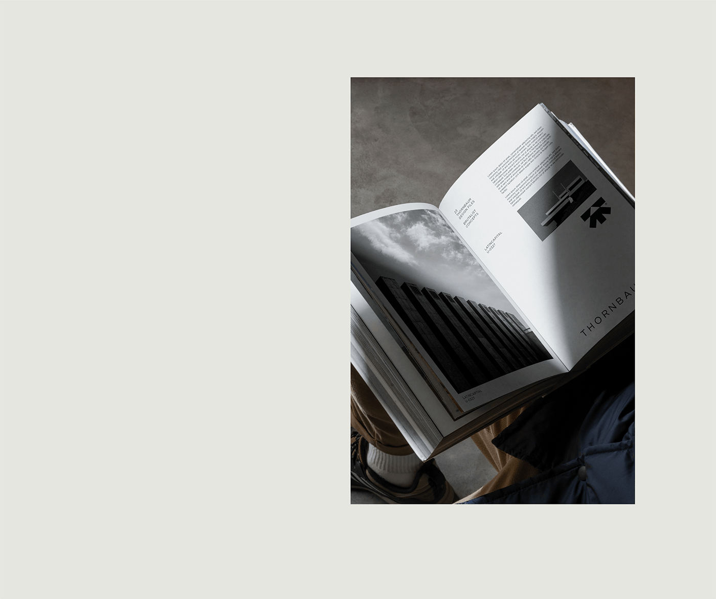
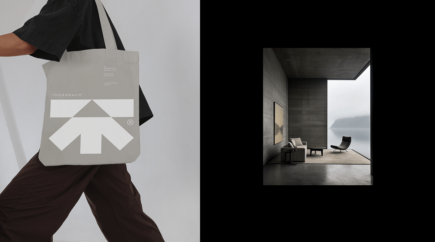
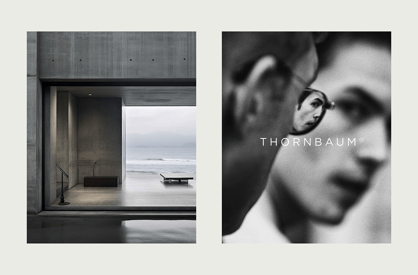
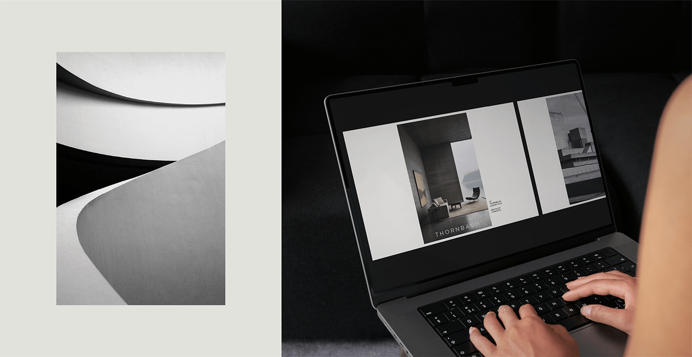
Its proponents saw brutalism as a way to strip away unnecessary ornamentation and create buildings that were honest, straightforward, and deeply human. Inspired by these minimalistic tendencies from the 40s and 60s, the new Thornbaum brand identity uses a monocrome dark color pallet with black and white imagery to emulate the feeling one has when looking at old archival pictures of brutalist architecture. Nostalgic, inovative, imposing and definitely breathtaking. No patterns or fluid shapes, but it rather embraces wide layouts,
To continue the minimal feeling throughout the brand elements, we chose Gotham Standard as our only font, with three different weights: book, medium and bold, these help with font hierarchy but don't overcrowd the other shapes and imagery.
A challenge in this project was to build excitement through attention to detail while using the minimum amount of graphic elements. The natural solution was to incorporate motion graphics into the visual identity language. Heavy and slow animations reflect de imposing and large structures found in brutalist architecture. a big focus was put on the weight of each movement.

Through this project we had the chance to go as minimal as we possibly could, while discover a new way of approaching design and layouts and using a darker and more imposing visual language that what we were used to. Thank you to everyone involved, it was a blast!
Credits:
Logo & Brand Identity: David Julean
Motion Graphics & Art Direction: Raul Lile
Composition & Copy: Ioana Groza